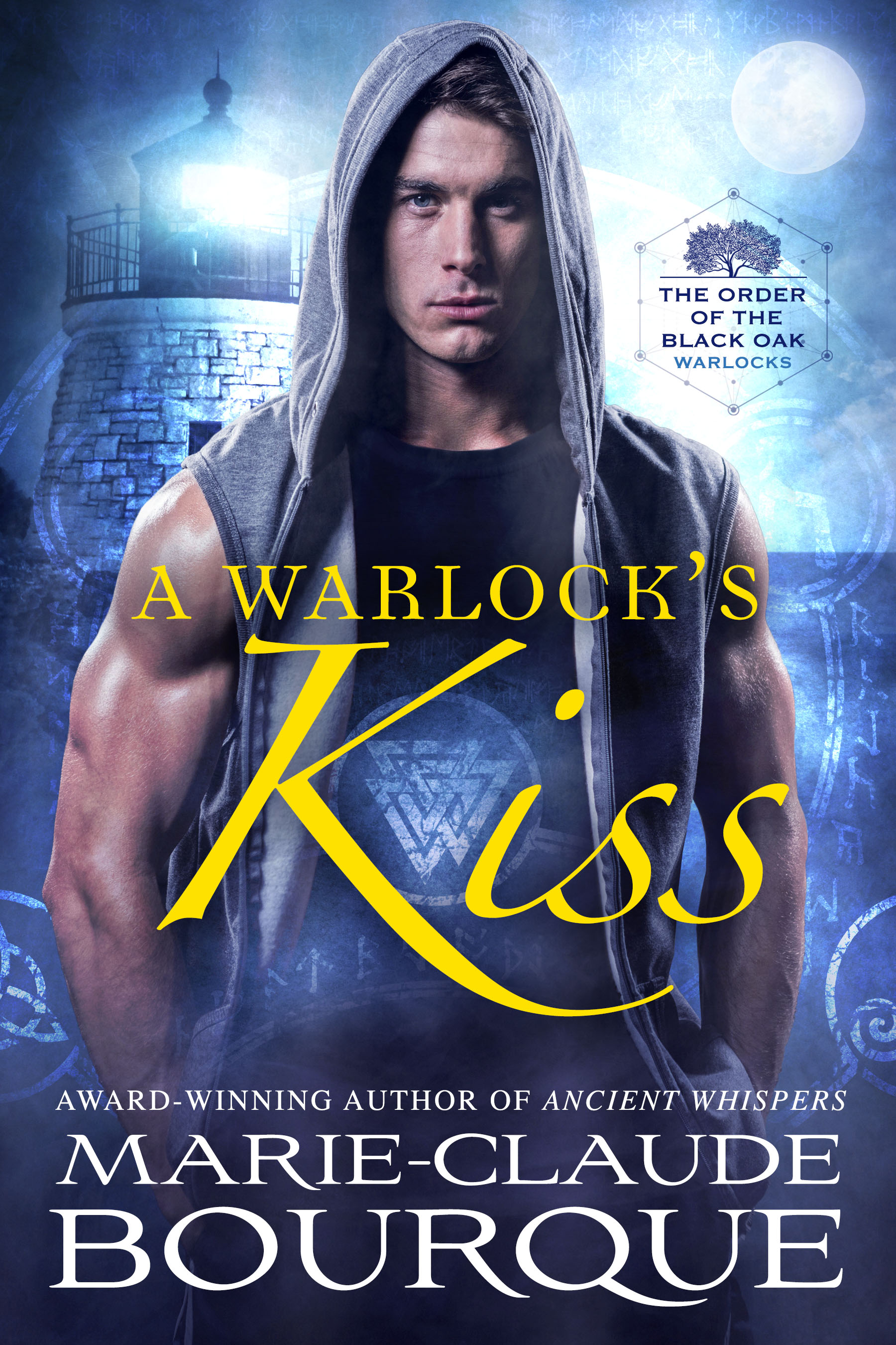
When InD’tale magazine emailed me to say they had chosen the cover of A Vampire’s Spell for their weekly cover contest, I was beyond thrilled. All credits goes to my designer, Frauke Spanuth, who I have been working with for the entire Black-Oak series.
Here are the things I shared with her when I commissioned the work. This is straight from my email to her:
…
Mood:
The mood is “winter vampires in an old city (Montreal dates from the 16th century).” The cold is really prevalent in the stories. So “blood on snow” feel or dormant bare trees, moon, gothic feels. Reds, blacks grey and white maybe? Winter clothings. Inspiration comes from the promo posters from the TV show The Originals
Tone:
Tone is gothic and deeply emotional, very romantic with lots of suspense, action and battles.
Heat level:
Heat is medium, slow-burn sexual tension, not overly graphic.
Story Location and season:
All stories are set in Old-Montreal, Canada. Vampire hero runs a teen vampire shelter hidden in an old nunnery in Montreal, so old buildings of that time, catholic symbols of that time. Snowy streets. Set in the winter season with snow and ice. Modern time. Not Christmas.
My hero VALERIEN (VAL):
Broodingly handsome, wears a heavy coat with fur collar, dark hair a little long, think Angel from Buffy or Jon Snow in Game of Throne.
…
Quite amazing result for such small input, don’t you think?


So sexy!
LikeLiked by 2 people
He is, isn’t he 🙂
LikeLiked by 1 person